Showing posts with label Art. Show all posts

Thursday, 13 April 2017

The Snowball

Now that A Book of Banished Words is published, I’ll conclude my posts about The Polar Tombola with the story behind the making of the ‘snowball’ which players picked their cards from during performances. (Thank you to everyone who took part!)

The drum holding these Greenlandic word cards was an obvious nod to the Italian tombolare that was the loose model for my game. So it ought to be round... but what else? As I began to design it I toyed with the idea of using a globe to reference languages around the world, because as The World Atlas of Languages in Danger demonstrates, language extinction is not a problem specific to the Arctic. But I soon discarded this idea in favour of something more snowy – evoking the traditional Inuit dwelling or iglu as well as childhood snowball fights.

 I visited the ceramics department of the Victoria and Albert Museum to source ideas. I started by studying how designers made tableware representing other objects, such as swans, snakes, cauliflowers and asparagus. (Please excuse the poor quality of the snaps below, they were never intended for publication.)


But the objects that appealed to me the most were simpler, in particular a beautiful porcelain moon jar by Park Young Sook (2006) – the refined clay with its translucent, flawless glaze seemed to evoke the same pristine beauty many people associate with the Arctic. Moon jars were used as ritual vessels in South Korea during the Chosun period. What was I embarking on, if not a ritual? I don’t want to reproduce my photo here because it doesn’t convey any of the awe I felt looking at the moon jar, but you can view it in the online V&A catalogue.

Knowing I’d never achieve the smooth perfection of Park Young Sook’s vessel, I started to look at other textures, such as...

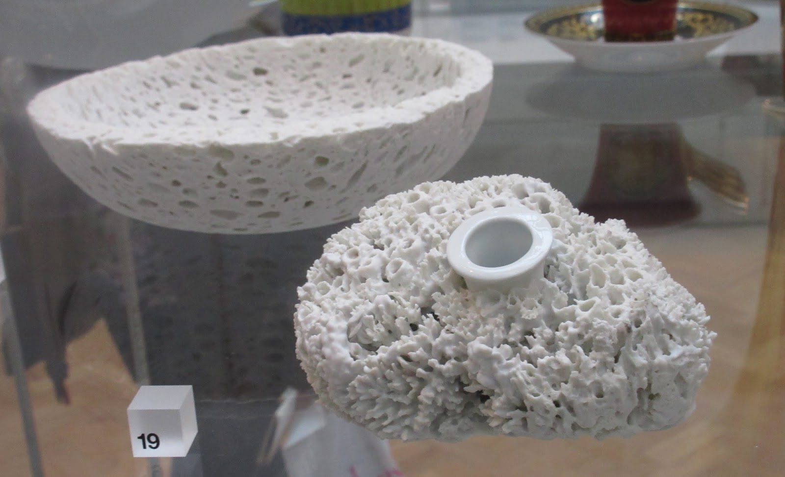
... Egg Vase (above), Foam Bowl and Sponge Vase (below), designed by Marcel Waanders for Droog, in collaboration with Rosenthal. (Made by Moooi. Amsterdam, The Netherlands, 1997. Unglazed porcelain, cast from hard boiled eggs inside a condom, artificial foam and a natural sponge.)


... and Omenanlohko (made by Gunvor Olin-Grönqvist at Arabia, Helsinki, Finland, 1986. Glazed stoneware.)

Finally, I looked at ceramics that included text. Nushu (below, 2006) by Sara Radstone is an evocative series of stoneware slabs, painted with slip and grey stain. 


Nushu is a script used to write a local dialect of Chinese spoken in Jiangyong County in Hunan. It was used exclusively by women, and translates as ‘women’s writing’. It developed as a form of private communication, sometimes embroidered onto fabrics or written on fans. Radstone’s text, written lightly and upside-down across a series of book-like forms, reflects the clandestine nature of the script...

...and far less subtle, but just as fascinating, this piece of French tableware which wittily mixes verbal and visual signifiers.


I also loved this early nineteenth century gilded plate, with its bobbly enamel sea urchin that –entirely coincidentally – is not so very different in appearance from my own finished piece.

In the end I chose to use a material much less ambitious than ceramic, and closer to my usual medium: papier-mâché. The cause of my return to paper was spotting a work by Chun Kwang-young in the museum. Aggregation10-SE032RED (2010, below) is composed of many hundreds of pieces of Styrofoam, individually wrapped in pages of books printed on hanji paper. Hanji has multiple uses in Korea – including wrapping household objects for storage. The surface this work is full of cracks and imperfections, and you can’t make out the original meaning of the texts. The curator writes: ‘These complex defects symbolise the difficult history of Korea, but the strong paper reflects the resilience of the Korean people.’ 


I liked the idea of taking apart a printed object to make the drum, which tied in with The Polar Tombola’s movement from the dictionary page to performance. Papier-mâché takes several days, as the thin strips of newspaper are dipped in an adhesive made of flour paste and applied over each other in a rough wove. There needs to be drying time between each application, and then a number of coats of white emulsion paint. The time it took to construct the two hemispheres of the drum gave me plenty of time to reflect on the process. As I covered one thin strip over and across another, current news stories disappeared under the damp paper and film of glue. It was a word-vessel made out of words. Slowly the object began to form, just as in the Arctic the gradual accretion of ice crystals, at first barely perceptible, becomes a solid layer over water. I thought of the Greenlandic words the drum would hold. One of these ‘amissaq’, has the dictionary definition: ‘boat skin, fish skin used for straining coffee’. I remembered the many new skins and surfaces I encountered in Greenland: permeable and impermeable, containing and protecting. 

I enjoyed making the papier-mâché drum enormously, the wordless activity being a respite from some of the intensive writing I’d been doing. I liked the rough edges of each hemisphere where they were pulled off the mould – this tied in nicely with the casual ‘village hall’ aesthetic of the project as a whole (as suggested by Small Publishers Fair director Helen Mitchell). Now that the snowball has travelled with me around the UK for two years, those edges are a little rougher, and the snowball is once again empty of its words. 


Wednesday, 18 January 2017

Bacon / Freud at Marlborough Fine Art


It was a great pleasure to write about two titans of twentieth-century art for the catalogue to the current exhibition at Marlborough Fine Art, London. The different approaches to printmaking demonstrated by Francis Bacon and Lucian Freud creates high drama in the gallery. Bacon and Freud: Selected Graphic Works is at Marlborough Fine Art, 6 Albemarle Street, London until 25 February 2017. The catalogue (pictured below) can also be read online.


Thursday, 14 July 2016

'Paint her to your own mind' - Shandy Hall


There's a blank page in Tristan Shandy, where Laurence Sterne invites his reader to recreate their ideal woman, to 'paint her to your own mind'. Such a gesture on the part of the author acknowledges that perceptions of beauty differ just as widely as the means of depiction might.

This spring the Laurence Sterne Trust challenged 147 writers, artists and composers to fill in the blank page with their own representations of beauty.

Now the results of this commission are on show at Shandy Hall in Coxwold, the home of Laurence Sterne Trust, until 30 September. All the works in 'Paint Her To Your Own Mind' are available to purchase by online auction, with funds going to the support the wonderful work of Shandy Hall. All artworks are anonymous, leaving the viewer to guess which artist created which page. Can you spot mine?


Sunday, 15 May 2016

New book: Bill Jacklin Graphics


British artist Bill Jacklin RA is known for his 'urban portraits' of cities from Venice to Hong Kong, and of course New York - his home since the 1980s. This summer the artist returns to the city of his birth with an exhibition of paintings currently on show at Marlborough Fine Art in London. Meanwhile a retrospective at the Royal Academy (opens 3 June), charts Jacklin's printmaking career from the ground-breaking etchings of the 1960s to the dynamic monotypes of recent years. 

Bill Jacklin: Graphics, a new and authoritative collection of the artist's prints with an introduction by Jill Lloyd and an essay from me, is published by the Royal Academy to accompany the latter exhibition. 

On Saturday 4 June Bill Jacklin will discuss the ideas and techniques behind his work with me at an event organised by the Royal Academy. 


Photo of Bill Jacklin in his studio by Chris Craymer. See more of the shoot in Vanity Fair.


Tuesday, 12 April 2016

The Flaw


The Flaw is the April exhibition over at Fabelist, an online exhibition space curated by writer and art director Francesca Goodman.

The project arose from my study of the paintings of Emanuel A Pedersen in the collection of Ilulissat Kunstmuseum during a residency last summer. 'Flaw' was a term once used by whalers to describe the outer edge of the landfast ice; its relevance to Pedersen's work will be immediately apparent to viewers.

Also online, last week I was interviewed for The Herring's Tale, a new blog by journalist Bibi Christensen which sets out to explore Danish culture 'with a London twist'.


Friday, 8 April 2016

Spring reading: art writing


  • an essay on the work of Yael Brotman in Scaffolding, the catalogue accompanying the artist's exhibition at Loop Gallery, Toronto
  • a review of Nikolai Astrup: Painting Norway at the Dulwich Picture Gallery, in the Times Literary Supplement
  • a review of The Power of Paper: 50 Years of Printmaking in Australia, Canada and South Africa at the Museum of Archaeology & Anthropology, Cambridge (catalogue edited by Nicholas Thomas) in Printmaking Today
  • I interviewed artist John Abell on his dramatic woodcuts created as part of a residency at Castell Coch, Wales, also for Printmaking Today (see below)


Tuesday, 22 March 2016

Sculptors in Print


Anish Kapoor, Fold III, 2014 Etching from two sheets, edition of 20, Each sheet 96.5 x 72.5 cm, Framed size 157 x 119.8 x 12.8 cm, courtesy the artist and Marlborough Graphics, London

The exhibition Sculptors in Print which opens at Marlborough Fine Art, London on 5 April will show iconic graphic works by Louise Bourgeois, Anish Kapoor, Richard Serra and Kiki Smith. I was honoured to be invited to write the essay for the catalogue that accompanies the exhibition, which continues until 30 April.

Monday, 6 May 2013

Sea Voyages in Contemporary Art


John Cumming Ditty Box (2011)

My review of the exhibition Voyage: sea journeys, island hopping and trans-oceanic concepts, curated by Imi Maufe and Rona Rangsch at Künstlerhaus Dortmund, Germany can now be read online in the Huffington Post

Monday, 14 January 2013

Voyage - New Exhibition in Germany


Next month sees the opening of Voyage: sea journeys, island hopping and trans-oceanic concepts curated by Imi Maufe and Rona Rangsch at Künstlerhaus Dortmund, Germany (which is, incidentally, a land-locked city). You can read a little more information about this exciting event here.

I'm currently at work on an essay for the catalogue accompanying the exhibition - more details to follow.